
POV: You’re invited to give a poster presentation at a big scientific meeting.
But, as the event gets closer, the doubts start to creep in. What if no one visits your poster? What if they ask difficult questions that you don’t know how to answer?
Whether you love or hate presenting posters, they are a great opportunity to generate feedback and discussion, get ideas for new project directions, and make connections that could lead to a future job.
And for PIs, posters are important in showcasing your lab’s latest research and attracting new collaborators, so it’s important that they are done right.
In this blog post, I’ll cover how to design an effective scientific poster that engages your audience, as well as tips to present your poster with confidence.
Get the cheatsheet:
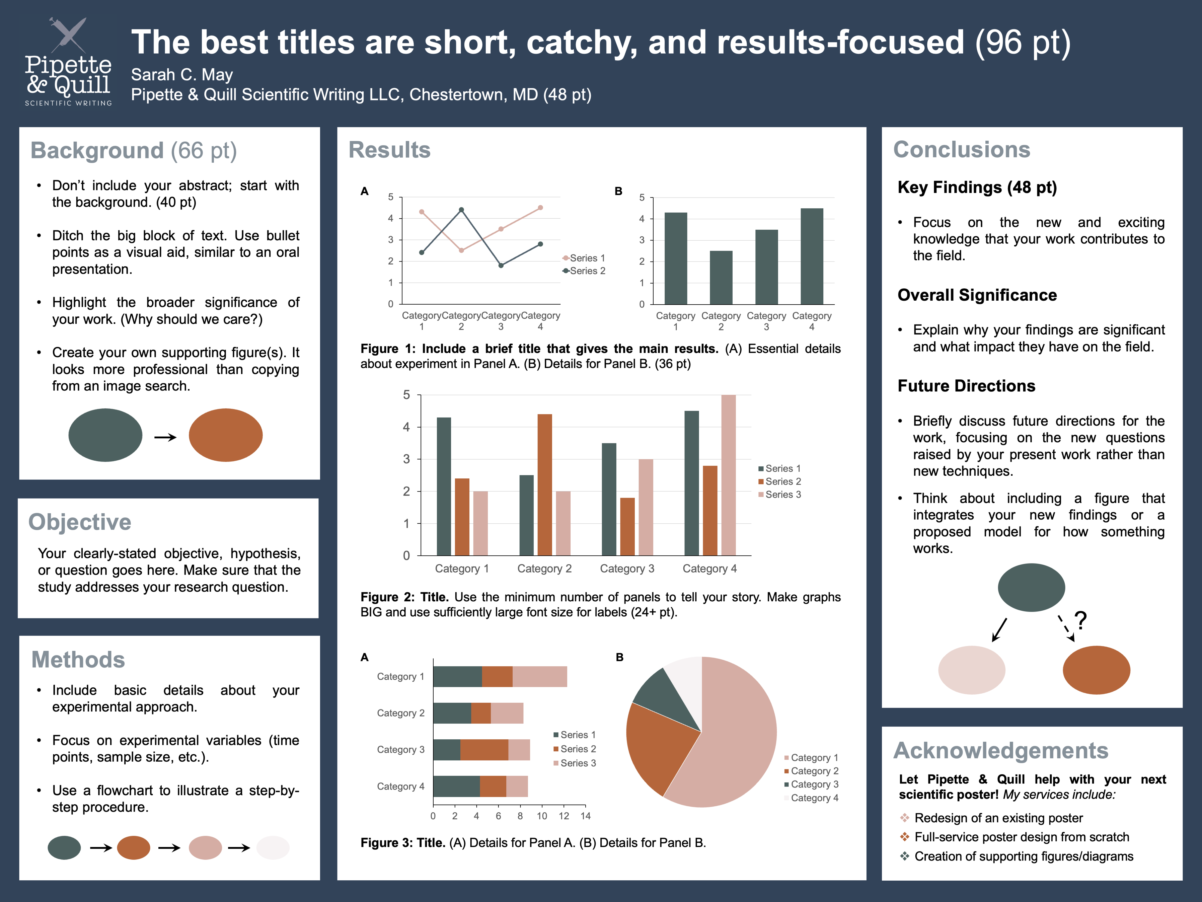
Poster Newbies: If you’re starting a poster from scratch in PowerPoint, you can set the slide dimensions to the exact size of your poster using the Design tab. Font sizes shown are general guidelines but always make text as large as possible!
Get Organized
Before you start designing your poster in PowerPoint (or your favorite program), use pen and paper to sketch an outline. Choose the content you want to include, estimate how much space you need for each section, and decide how to best arrange it.
Stick to a logical flow. A good rule of thumb is to arrange your poster like you would read a book, from left to right and top to bottom. Don’t make your audience follow a maze to get to your conclusions.
Keep it tidy. Clearly delineate sections with bold headings and boxes. Only use solid-colored backgrounds, no busy and distracting images.
Incorporate white space. Filling every inch of available space with text and images is not the way to impress someone visiting your poster; it’s how you clearly articulate your work to them that matters. White space is a great tool to prevent overwhelming your audience, and it improves readability.
HINT: Pay attention to bullet point spacing. Adding white space between separate bullet points makes it easier to read them as individual thoughts.
Use Text Sparingly
The number one mistake that people make when designing posters is using too much text.
Telltale signs that a poster has too much text include 1) using a smaller font size to cram everything in, 2) lack of white space, and 3) from a distance, text appears as a gray box.
Some people put their entire abstract onto the poster, but I advise against it for a number of reasons:
- It’s redundant. The poster should cover everything in the abstract.
- You should be at your poster during the scheduled time to present your work and answer any questions.
- Your abstract can often be found in the conference booklet.
- Big blocks of text are visually unappealing and won’t entice anyone to visit your poster.
What should you do instead? Think of it more like giving a research talk but using a poster instead of slides as your visual aid.
Format all text in bullet points or in 1–2 sentence paragraphs.
The poster title should be short (on one line) and catchy (to spark curiosity and engagement). Use clever wordplay like incorporating an idiom or common phrase into your title. Search for “phrases with [keyword]” to get inspired.
The overall title and any figure titles should highlight your results — not the methods.
Instead of… “Evaluation of Vancomycin Antibacterial Activity Using a Disc Diffusion Assay”
Use… “Narrow-Spectrum Antibiotic Vancomycin Inhibits Methicillin Resistant Staphylococcus aureus”
There is one exception: if you developed a new technique. But, even then, you are highlighting the important results of your work.
Focus on Figures
Figures should visually dominate your poster, but that doesn’t mean you should include every graph you’ve ever made!
Simplify your message by narrowing it down to only the most relevant and exciting data. This is your highlight reel, not a lab meeting presentation.
Enhance visibility. Use large figures and increase the font size of axes and labels. Test it out by setting your document to 100% and standing 5 ft away from your screen to ensure it’s still readable.
Background and summary figures are an excellent way to drive home your message. Many people copy pre-existing images from a web search into their background sections, but so many resources now exist that make it easy to create your own figures.
Here are some options for both beginners and advanced users:
- BioRender: Offers a user-friendly interface and a huge library of life science icons, but subscriptions can be expensive.
- PowerPoint + NIH BioArt Source (free icon library): A basic alternative to BioRender that most people already have access to; however, it may take more effort to develop nice-looking figures.
- Adobe Illustrator: A subscription-based program that allows for complete design flexibility; best for more advanced users.
- Work with a graphic designer: No effort is required on your part, and as a bonus, you get totally unique designs that help your research stand out.
FYI – If you’re considering option #4, P&Q offers affordable and custom services in figure design. Check out my portfolio.
Consider Your Color Scheme
Color has a powerful impact on our moods, behaviors, and how we perceive others.
Your color scheme will be one of the first things your audience notices, and it could even be the deciding factor in whether someone stops by your poster. It’s important to choose color schemes that not only look nice but also work to strategically tell our story.
We have built-in associations with different colors. Red can evoke feelings of danger (think stop signs), whereas the blues and greens of nature have a calming effect. In poster design, it helps to align our color choices with how we want the audience to perceive something (red = bad outcome, blue = good outcome). Think about how you can apply color psychology to your own work to improve your audience’s understanding.
Color can also be used to emphasize key points. Vibrant and high-contrast colors draw attention, while neutral and muted colors fade into the background.
Pleasing color schemes are more attractive and inviting, potentially leading to more engagement at your poster. You don’t have to be a design expert to find good color schemes. Play around with online color palette generators, like this one: https://coolors.co/.
Present Your Poster with Confidence
The first step in preparing for a presentation is to know your audience, but at a poster session, your audience could be anyone from an undergraduate who knows nothing about your work to a leading expert in your field.
The type of conference can give you a clue. You are more likely to run into an expert at a specialist conference vs a large conference with broad research themes. To be safe, you can always ask, “Are you familiar with [topic]?” before diving into the details of your work.
Practice ahead of time and make sure your presentation is no longer than 3–5 minutes. Have a general idea of what you are going to say, but don’t follow a script or read off the poster. It should come across as a natural conversation.
Engage with your audience. Sometimes people walk slowly by your poster and you’re not sure if they are going to stop and listen. Just smile and say, “I’m happy to answer any questions or walk through my poster!” Don’t forget to make eye contact while presenting.
If you don’t know the answer to a question, say something along the lines of “That’s an interesting question. Thank you. I don’t know the answer, but if I had to guess, I would say…” Remember most people are not out to get you! And if one conversation doesn’t go well, brush it off. You get a clean slate with the next one.
Thanks for reading!
I hope this helps you feel more confident at your next poster session. If you’re looking for more personalized support, Pipette & Quill offers custom poster design services.

Want more quick quill tips? Follow Pipette & Quill on LinkedIn or fill out the form below to subscribe!

